The UX design was a very iterative process, involving a lot of playtesting to try and find the most intuitive interactions for players. The main goal for the UX design in Ashi was to be as minimal and subtle as possible, to encourage a sublime, meditative experience that focuses the player on puzzle solving.
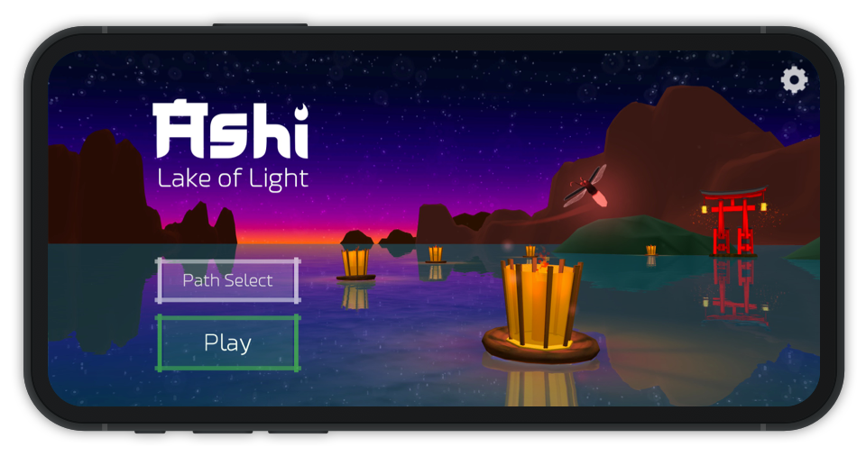
Ashi title screen
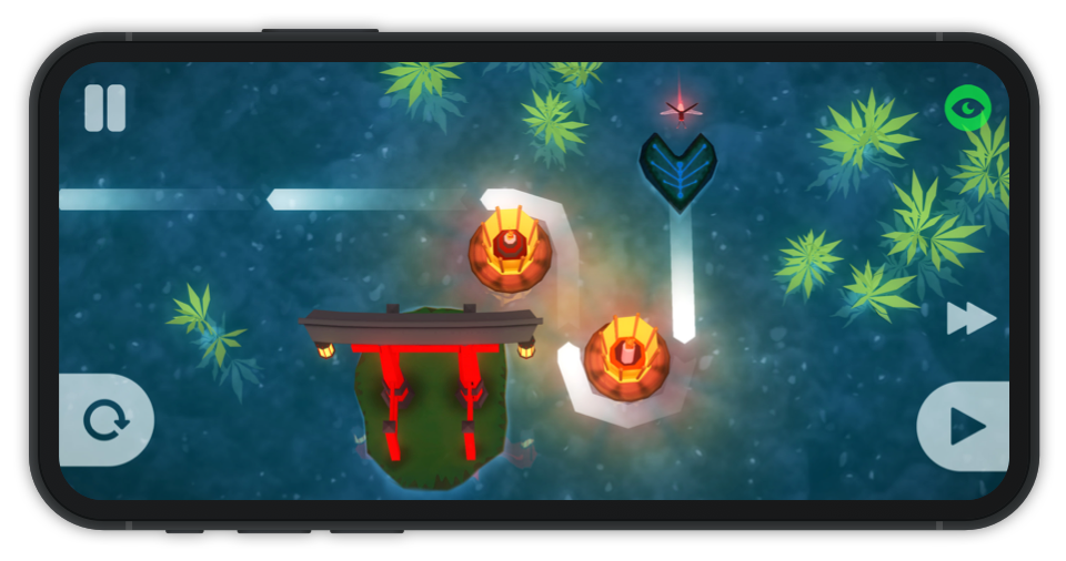
Ashi main game UI
Ashi is available on PC, Mac and mobile (iOS & Android), but I designed it for mobile first. The buttons are large and minimal, allowing the 3D game to shine through and be the primary focus.
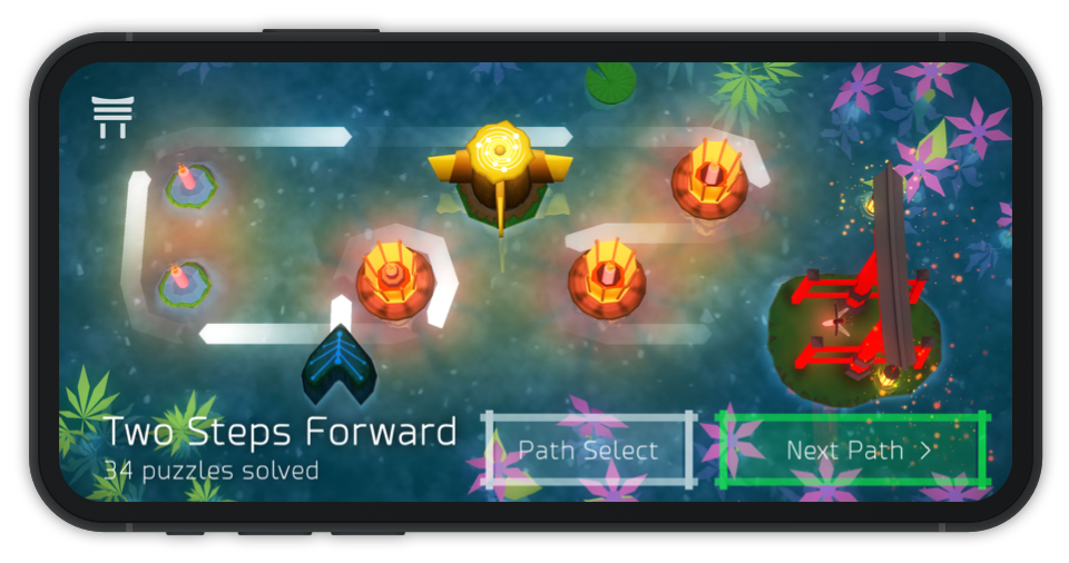
Ashi puzzle complete screen
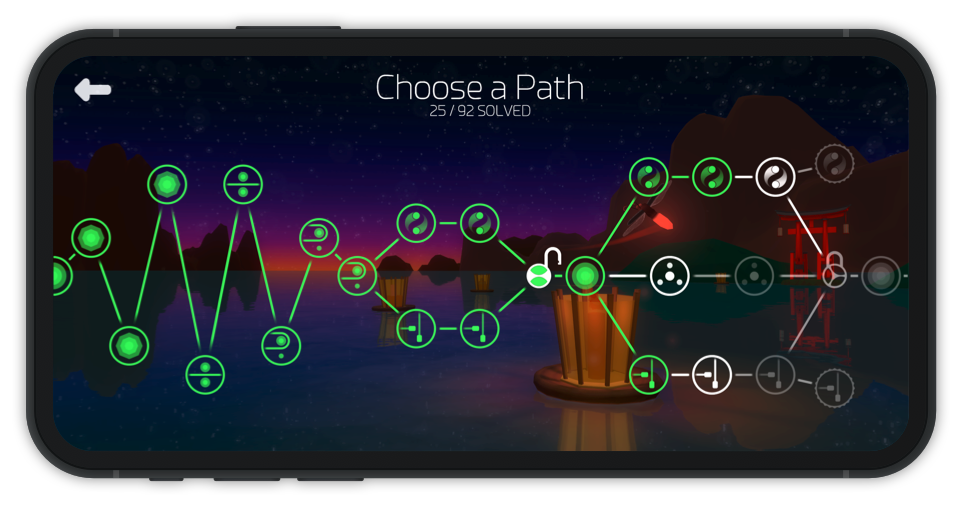
Ashi level select screen
I wanted to design an experience to create a stress-free atmosphere, encouraging calm problem solving & experimentation for the player.
I eliminated time-based gameplay and reduced player punishment as much as possible.
Self-teaching was a large priority for me in this game, as I wanted to emphasise the feeling of discovery and self-satisfaction.
I avoided adding word-based tutorials as much as possible, instead designing puzzles that increase in difficulty at a slow pace and implicitly teaching puzzle concepts as you play.
I started designing puzzles on paper, attempting to teach mechanics with a collection of puzzles.
As a rough guide, each puzzle would introduce a mechanic or idea, develop it, add a twist and present a final conclusion puzzle.
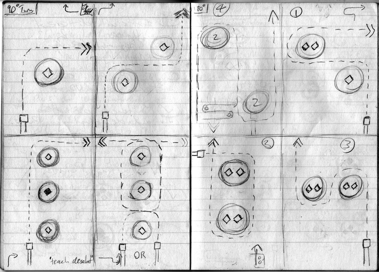
The first few puzzles teach core puzzle mechanics
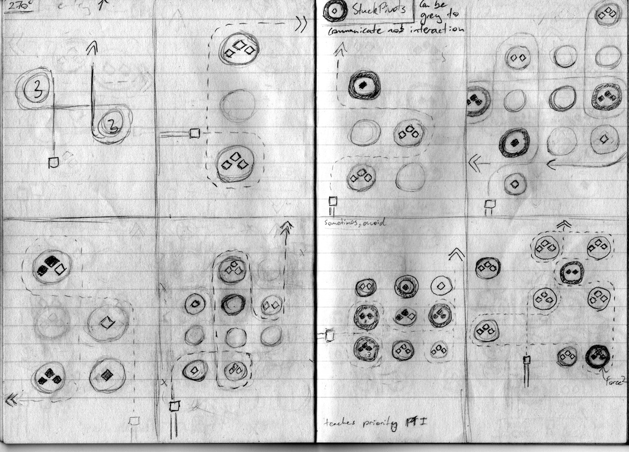
Teaching 270deg turns and lanterns that can't be changed
Learning through play can create emotional experiences, and allows learning at a custom pace.
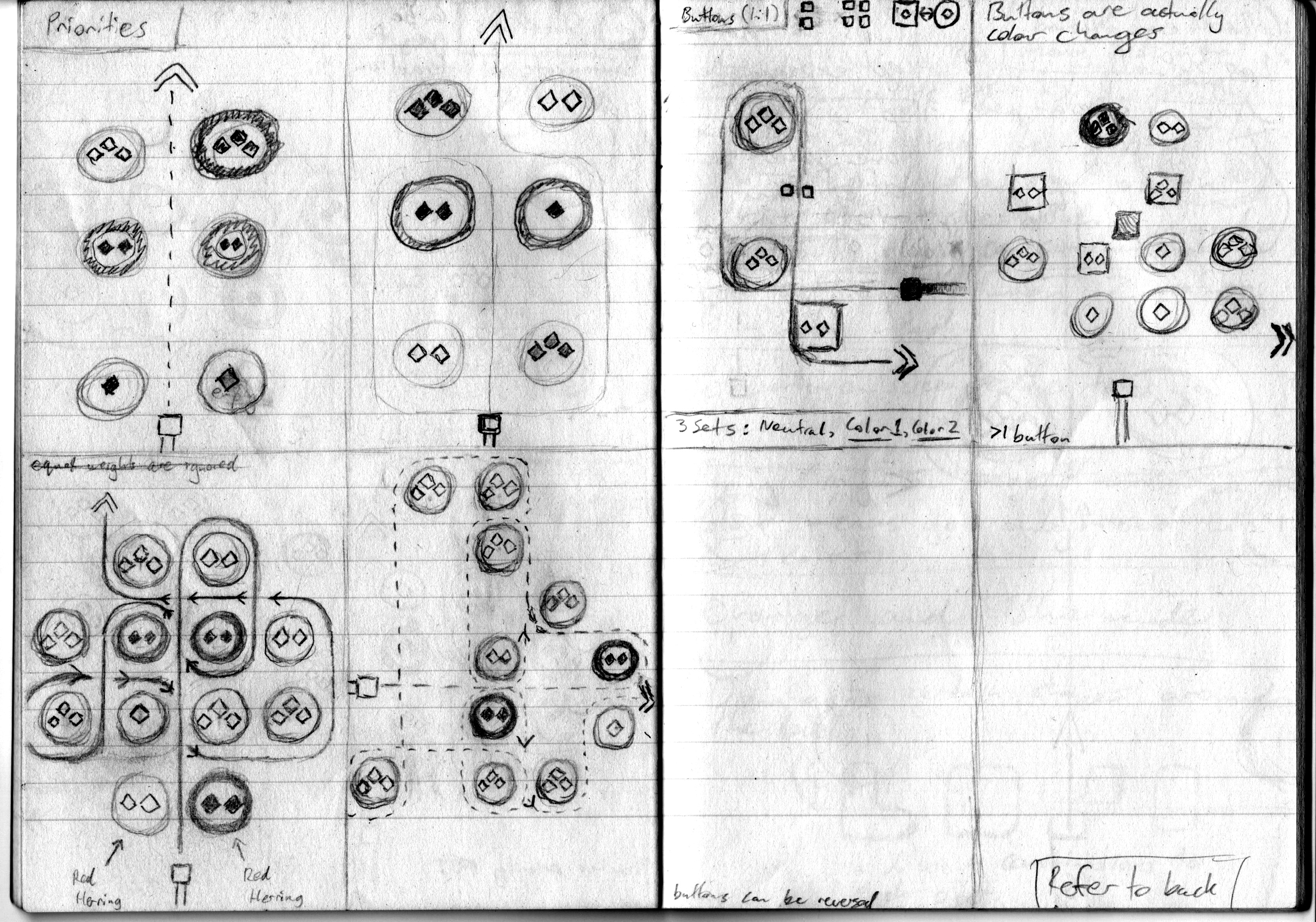
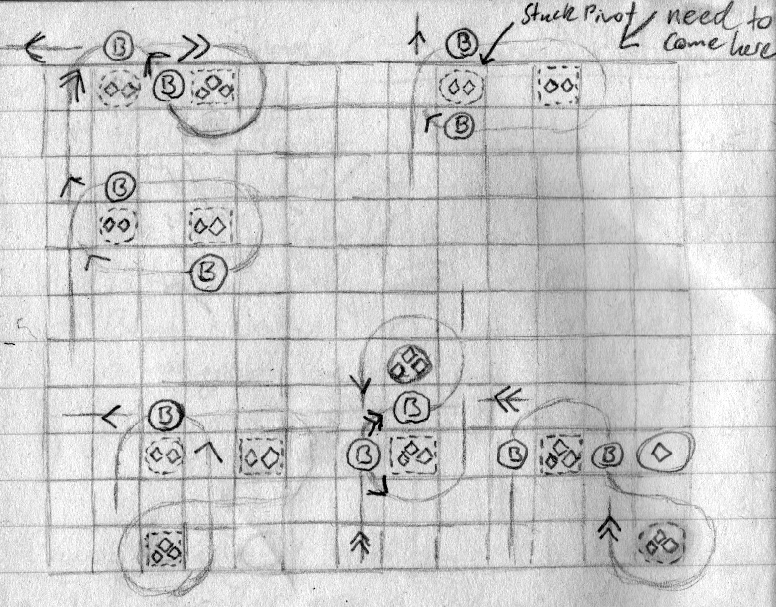
Teaching 'priority' - if the agent passes between 2 lanterns, which does it orbit around?
Initial design of the polarity mechanic, initially they were buttons